Mixpanel
Design System
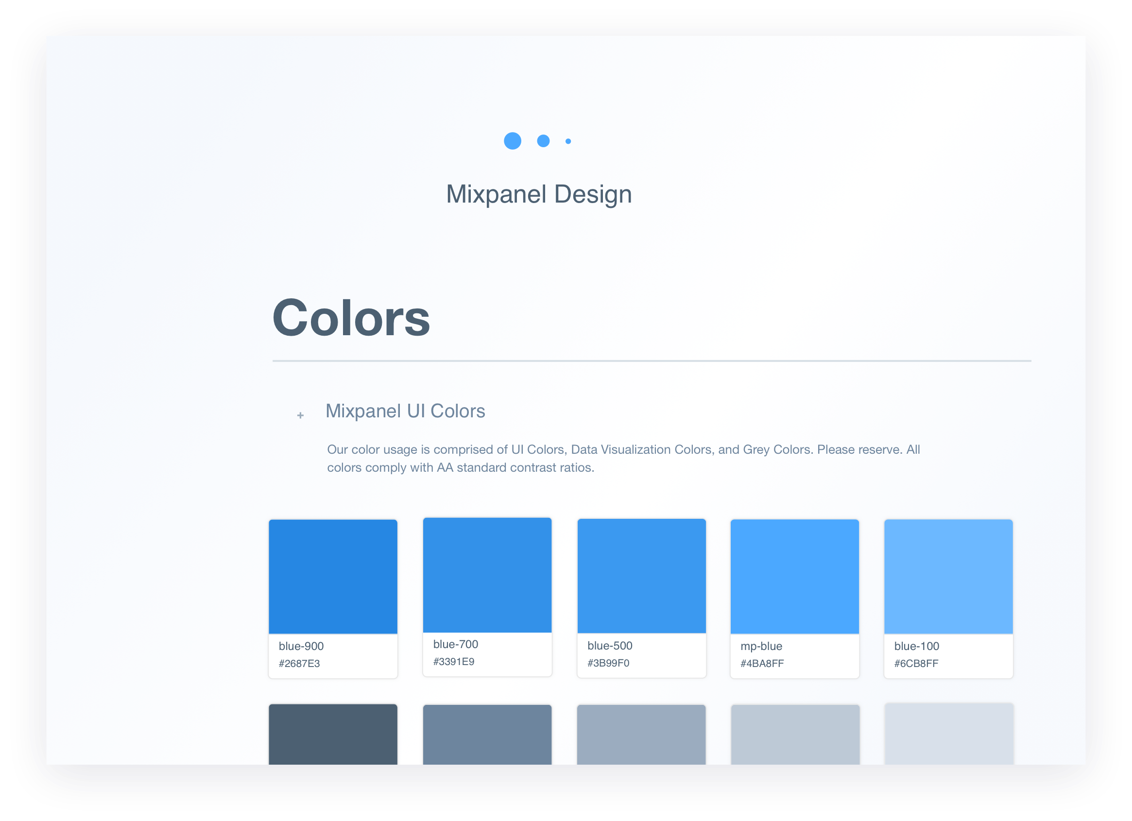
Mixpanel

The entire organization felt the strain of wanting and needing to move faster, and with more efficiency.
In addition, having grown to a design team of 11, and an EPD team of nearly 60, it was imperative we unified not only our product interface, but our product process. With multiple designers and PMs and no dedicated person to maintain the product's design direction, multiple variations of primitives, controls, and components found their way into different reports.
We had to find a strategic and realistic way to develop this system, and implement it across an already 8 year-old product, and a team used to their habits.
Project Deets
Product Goals
Over the years I’d started a product audit so we already had a jump on some of the UI problem areas in terms of inconsistencies.
I'd broken the product UI out into its various components based loosely on Brad Frost's Atomic Design principles, and the function each component served within Mixpanel.
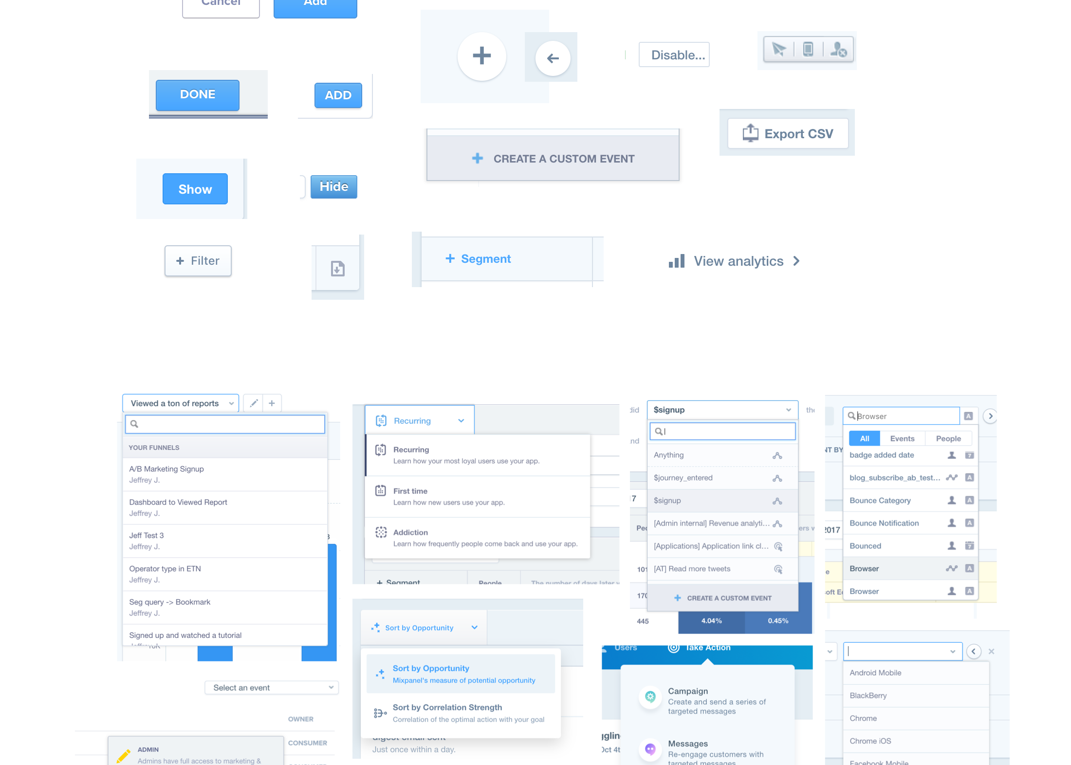
After much deliberation as an EPD team, we came to the conclusion it would be best to start with:
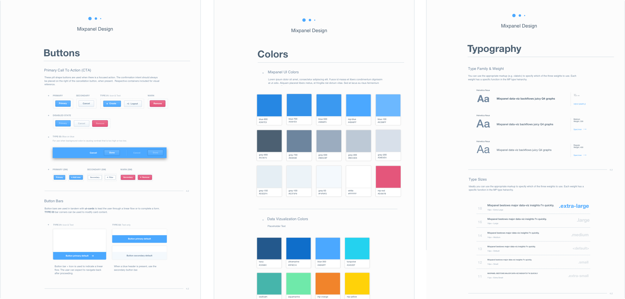
Color and typography would have the biggest impact in laying a foundation for unifying the product and creating a solid visual language. Consistent CTAs was a step toward giving our users the muscle memory and confidence to tackle the tasks they came to Mixpanel to tackle.
I wrote a short Javascript that crawled the Mixpanel UI stylesheets and js files pulling out all colors and converted them to 2,015 unique hexcodes. I then did the same for fonts and found 35 unique font-size and 42 unique font-family declarations.
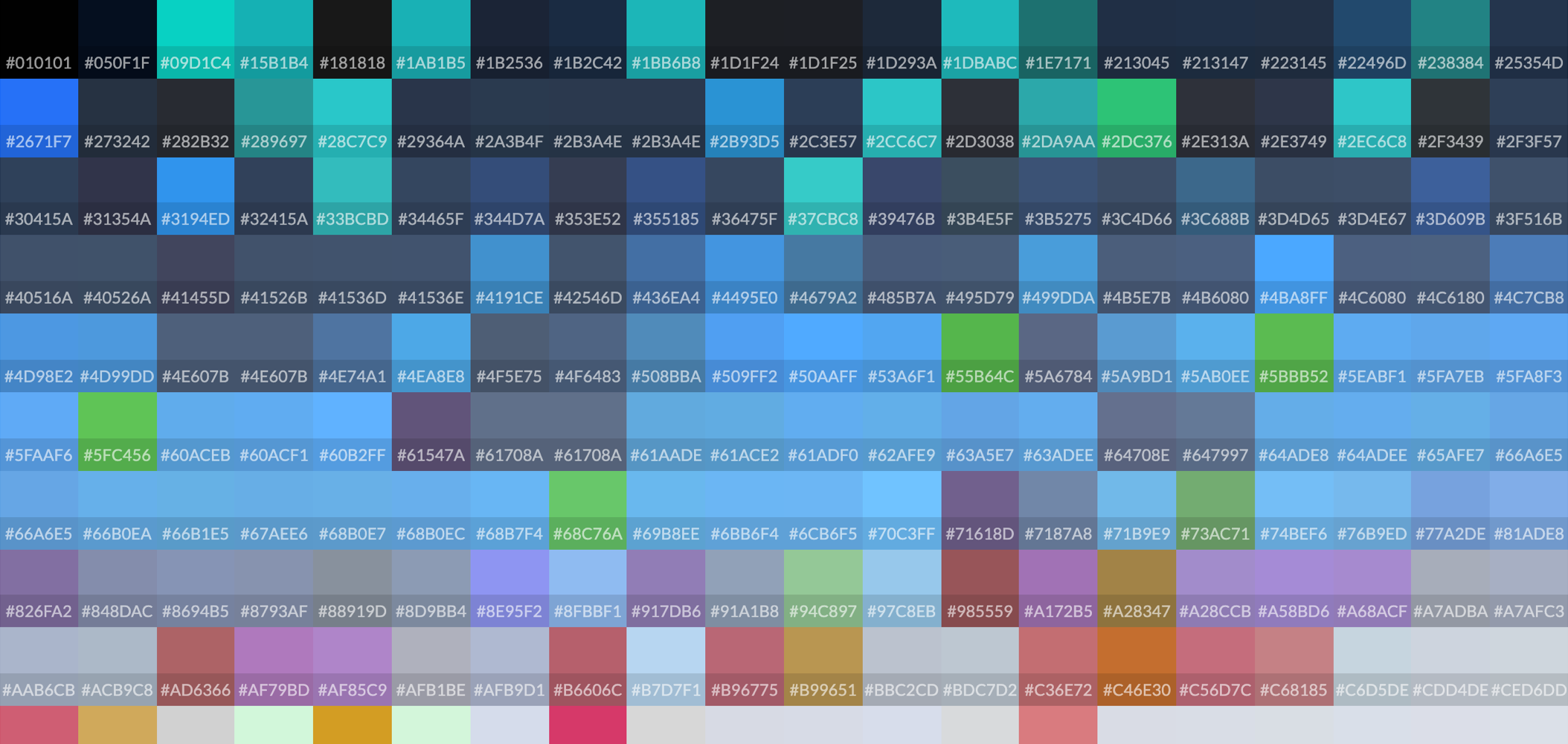
After we had all the colors from our marketing site and product properties, I wrote a script to sort them based on their HSL values. From there it would be much easier to pin-point like-colors to Find & Replace throughout the UI.
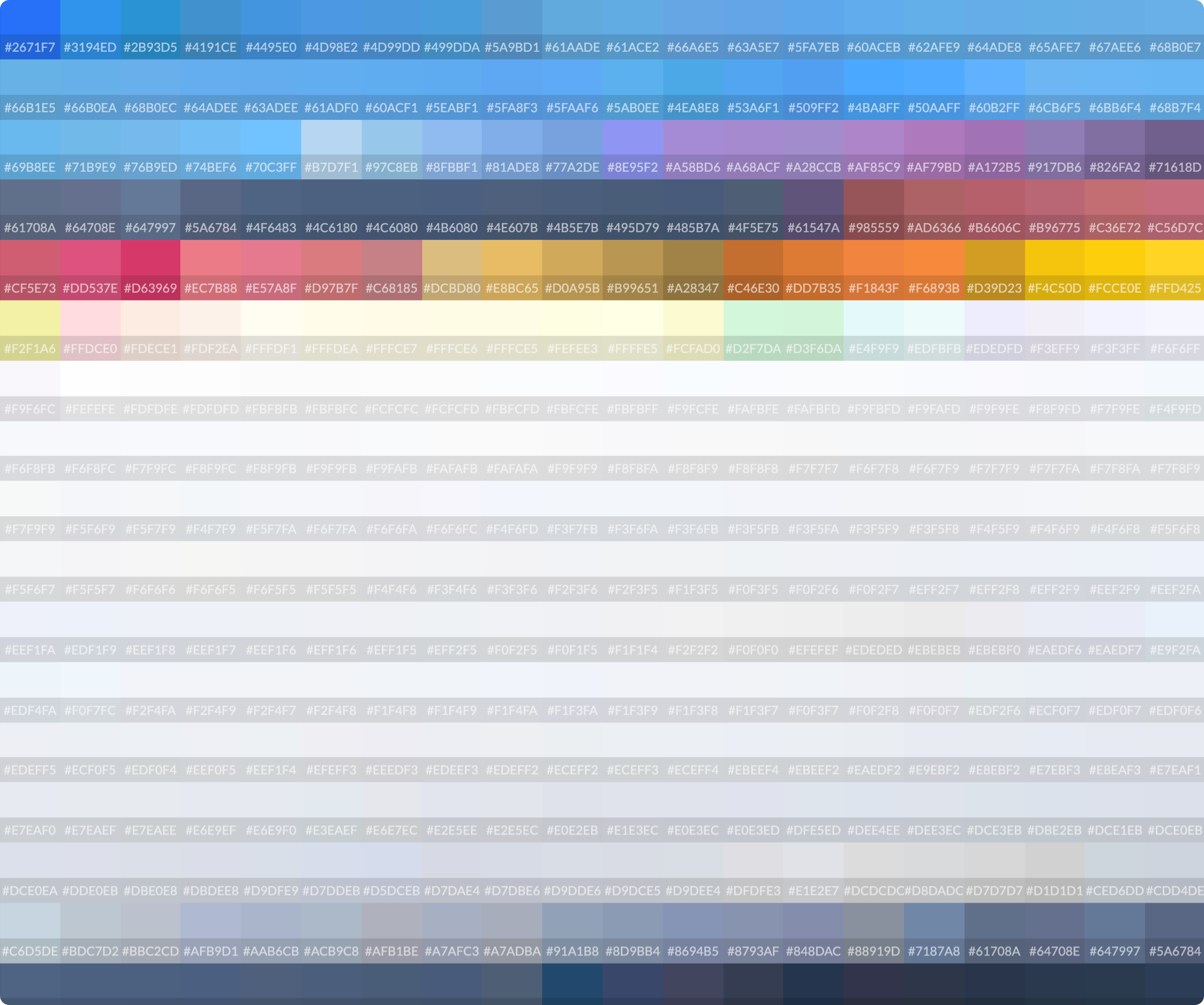
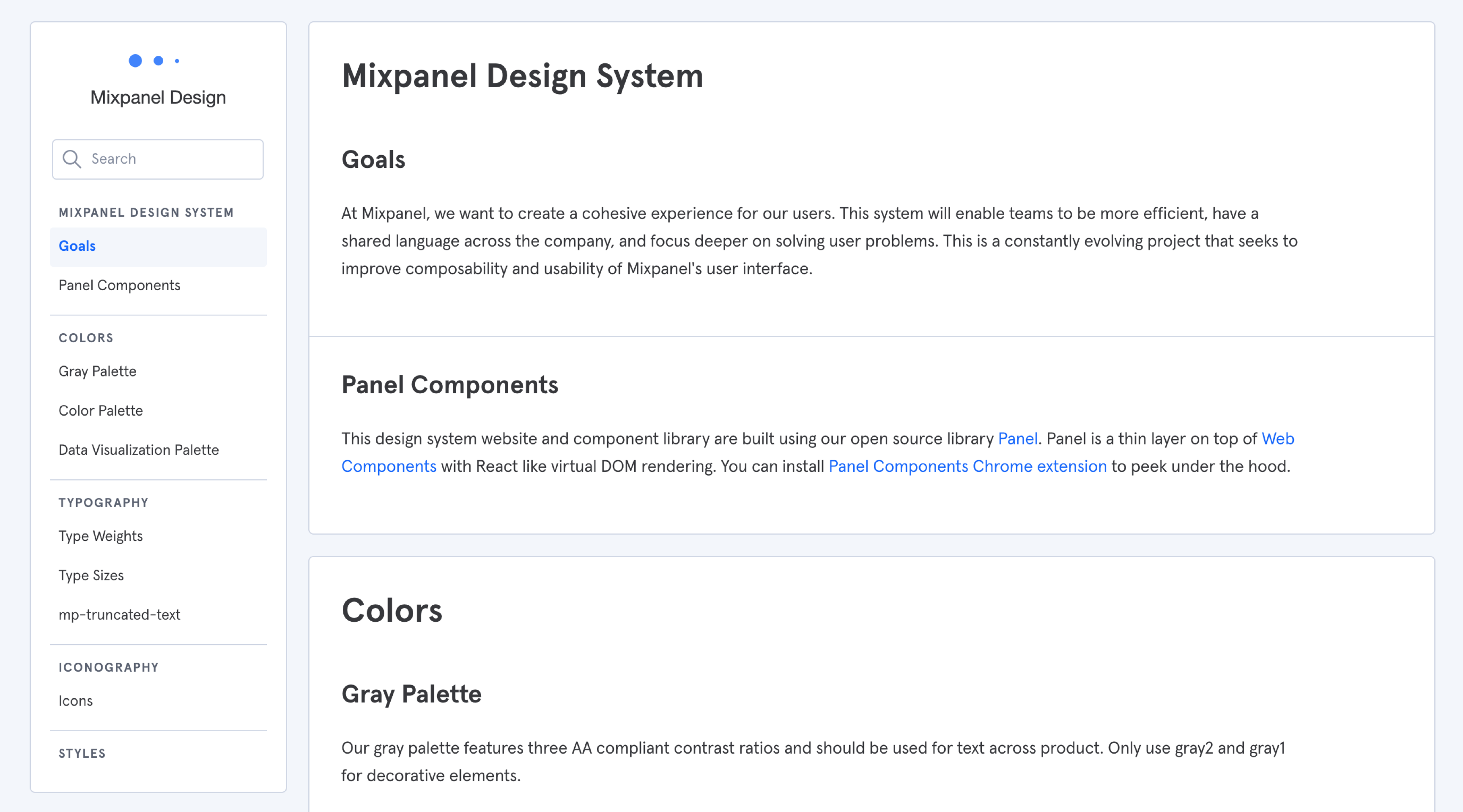
After multiple iterations, practical applications, and usability tests (especially for color and accessiblity) we established a foundation for Mixpanel's Design System.
Integration was one of the more difficult problems to solve. In an ideal world, we’d have a single source of truth that would pull in updates we made to design elements, and the push them to their respective properties in code. Three years later, there are entire companies dedicated to this exact problem (Abstract, Sketch Cloud, Figma, etc.)
Since this was a V1 (and to a certain extent a proof of concept), we didn't have the time or resources to do it "right".
We finally landed on a solution that while not automated, worked for our team and its size.
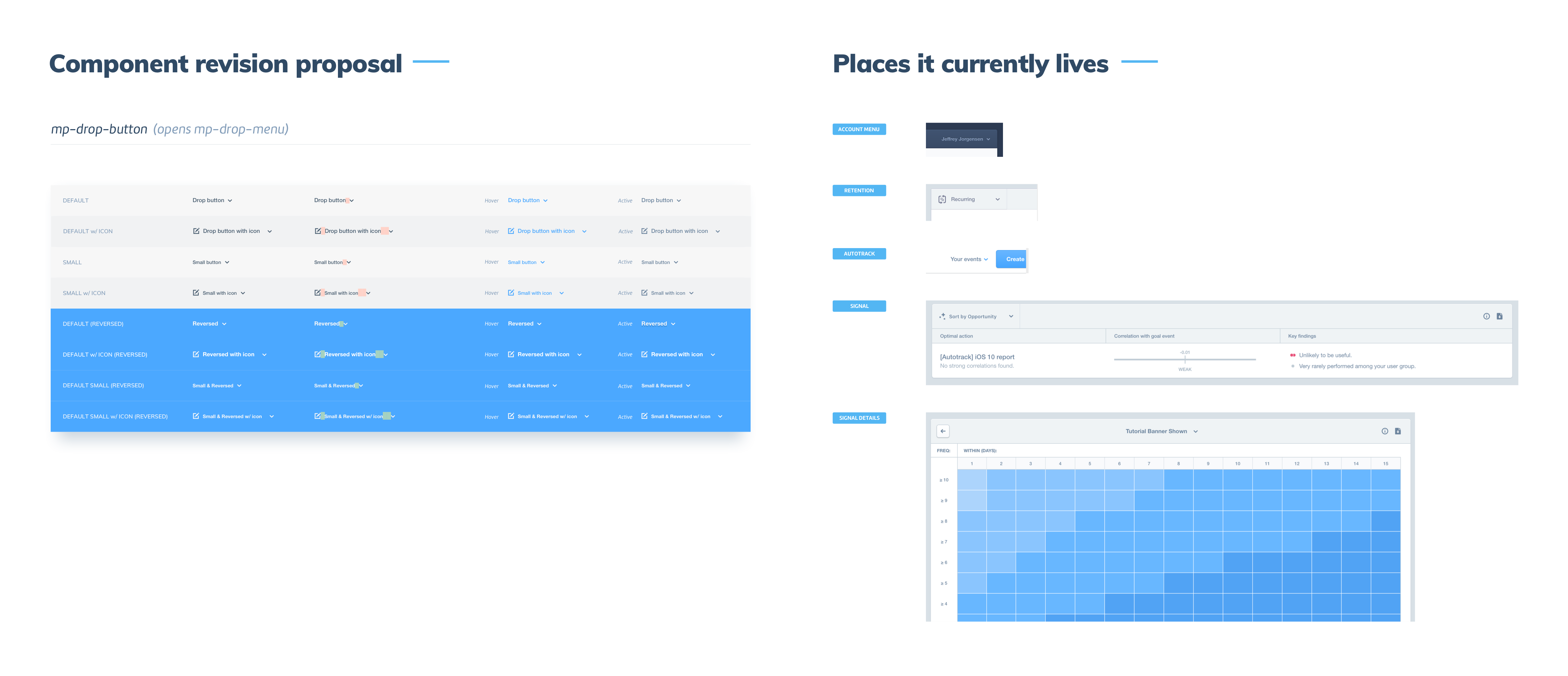
Present your design proposal to the team outlining why the component or change is necessary:
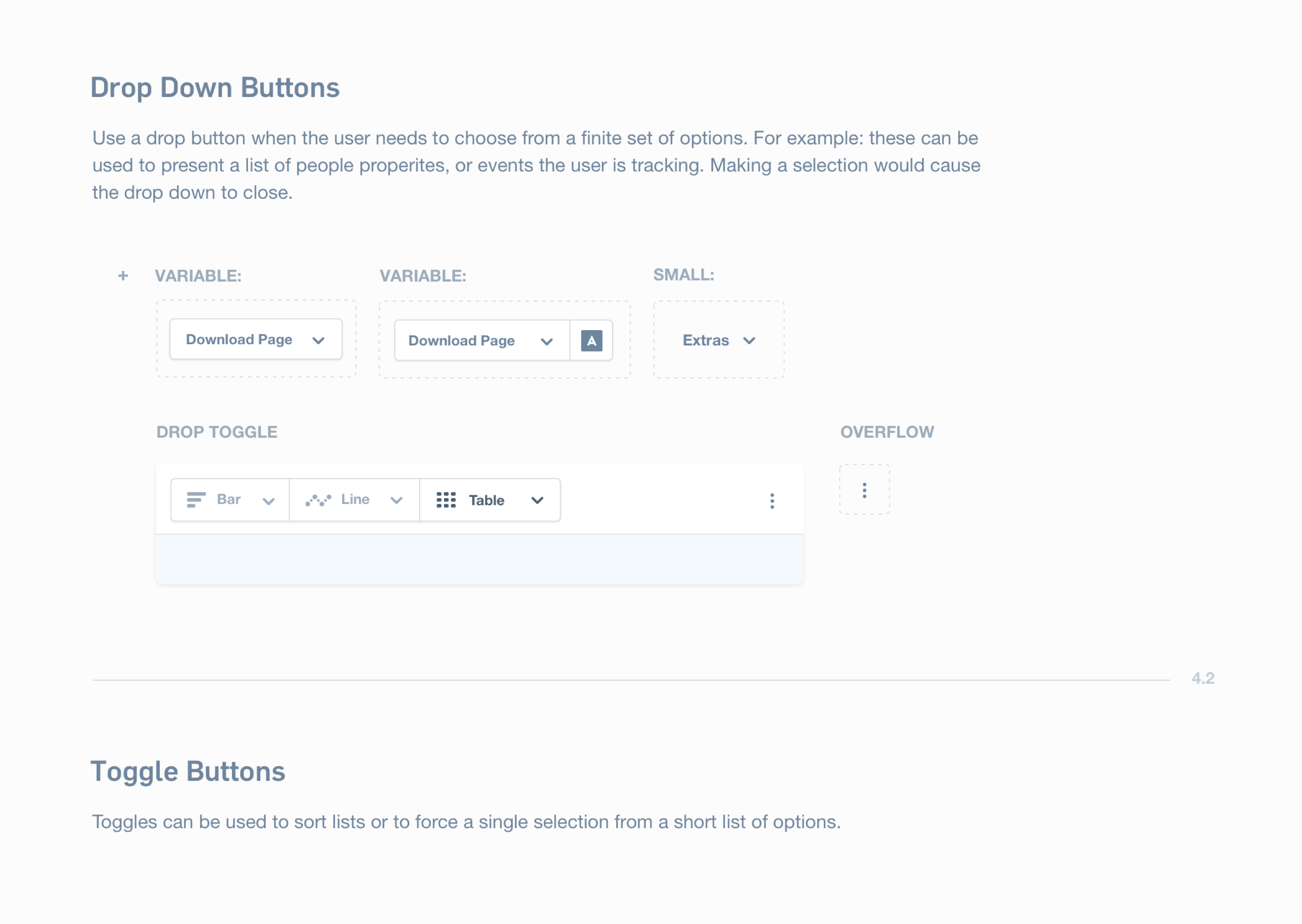
If approved, add your component to the Design System Master sticker sheet:
The designer then notifies either myself or the other Design Systems designer:
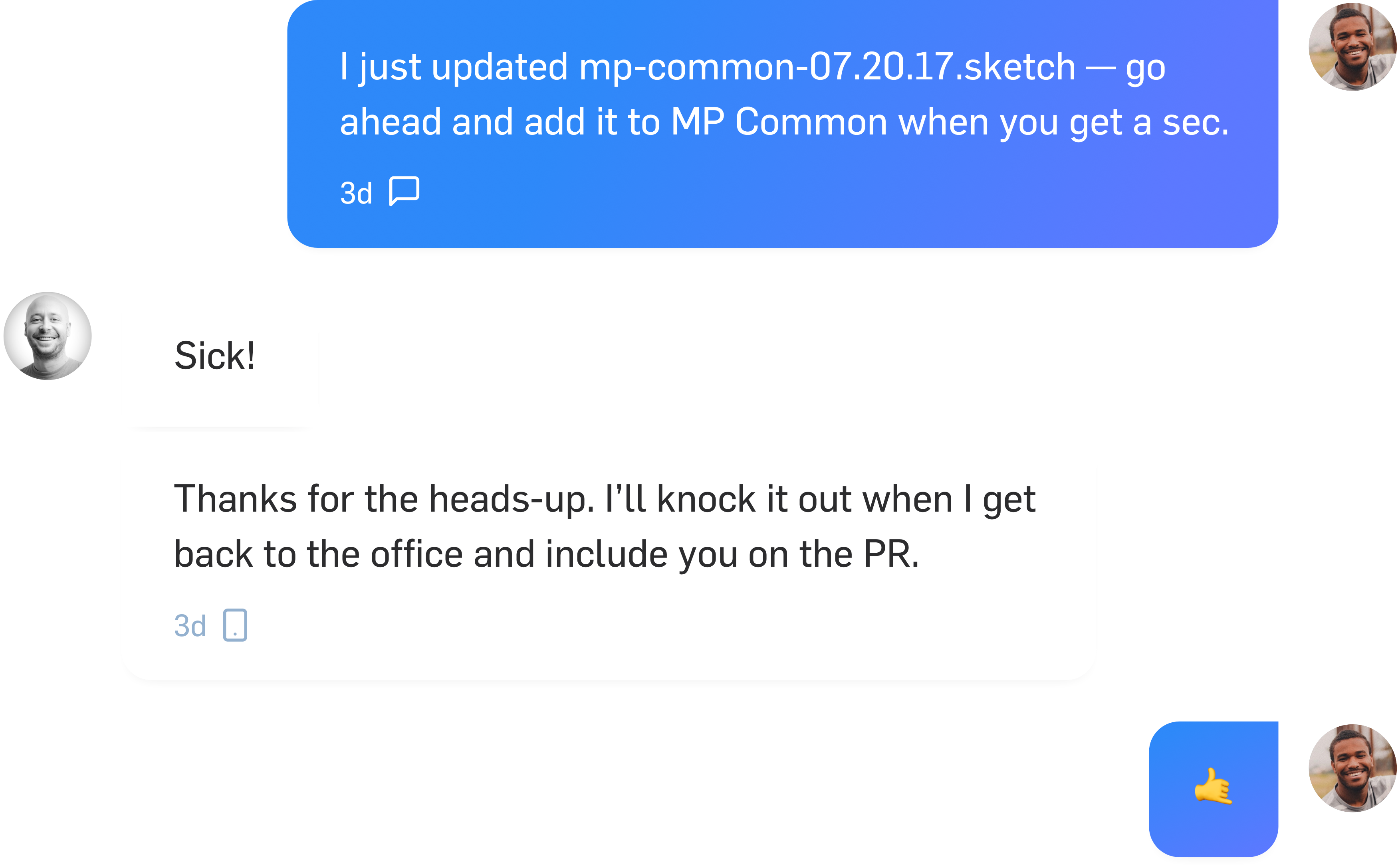
Component is built and added to a Github repo and a PR is opened for engineering review:
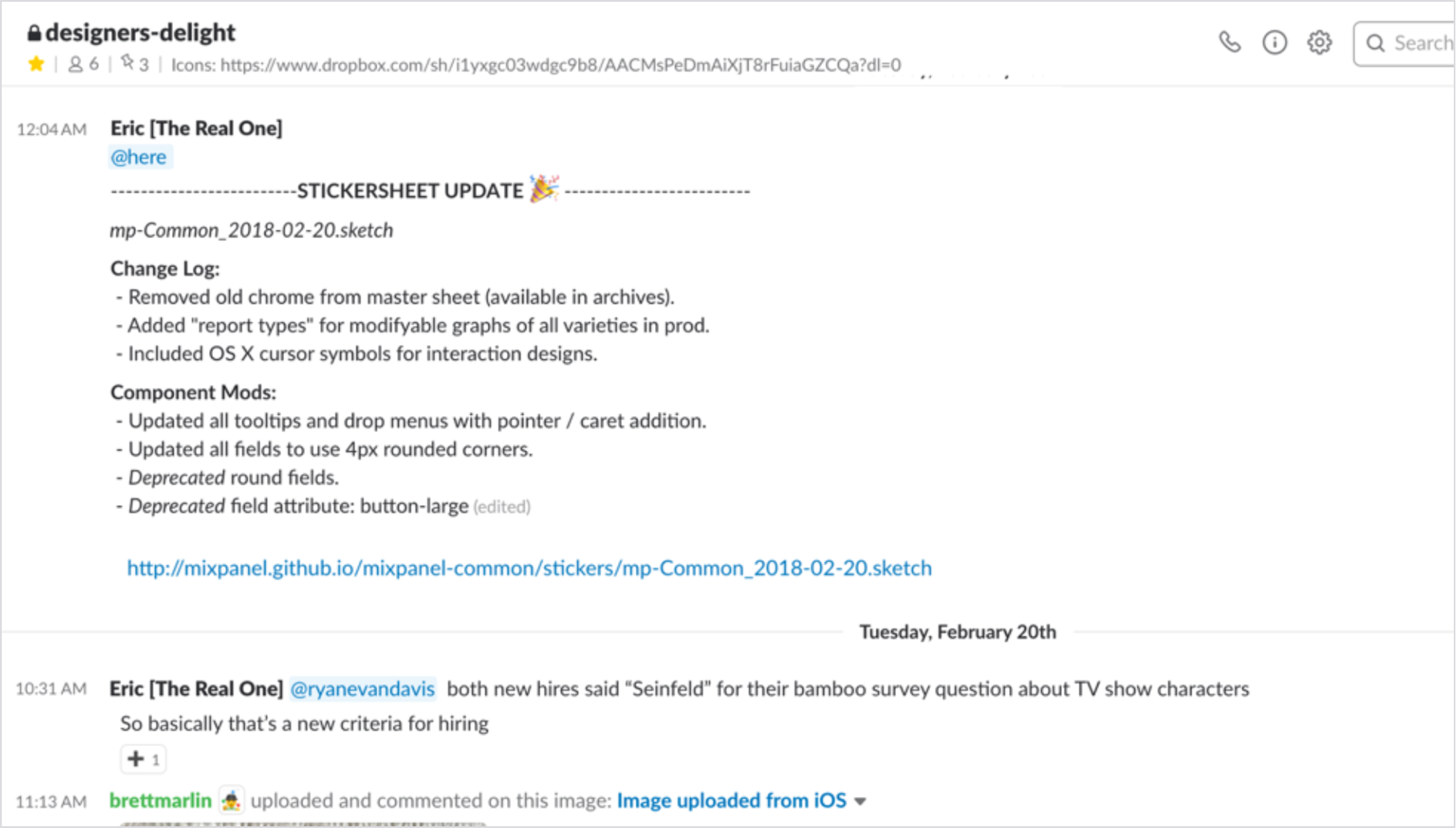
It was necessary we make sure everyone knew what updates had been made to MP Common.
The Mixpanel Design System was a highly-successful internal project. While tough to measure, we estimated it helped increase effeciency within the team by ~30%. Perhaps the most important thing it did however, was boost the morale of the team as a whole. It brought the design team and EPD organization together more than anything else we’d built because everyone was working in lockstep the entire way.
It’s still being used today, including most of the patterns, elements, and components we established in the beginning.
I would speak with more executives and broaden the userbase/usertype we interviewed.
After launch, we learned people lower in the organization would often forward KPIs onto higher-level colleagues who weren’t regular Mixpanel users. Mixpanel mobile didn’t afford them the ability to do this, and thus we had to re-enable the Digests feature for ~20 companies.
Two years later we eventually redesigned and rebuilt Email Digests making them move robust and powerful.